I’m writing today to share some changes we are making to the UI for the forthcoming release, Banktivity 9. Namely, we are adding support for a single-line register!
Take a look at the screenshot below to get a sense of how this feature is coming along. Please note, the screenshots below are not final, but we wanted to share them so you can leave us your thoughts in the comments.
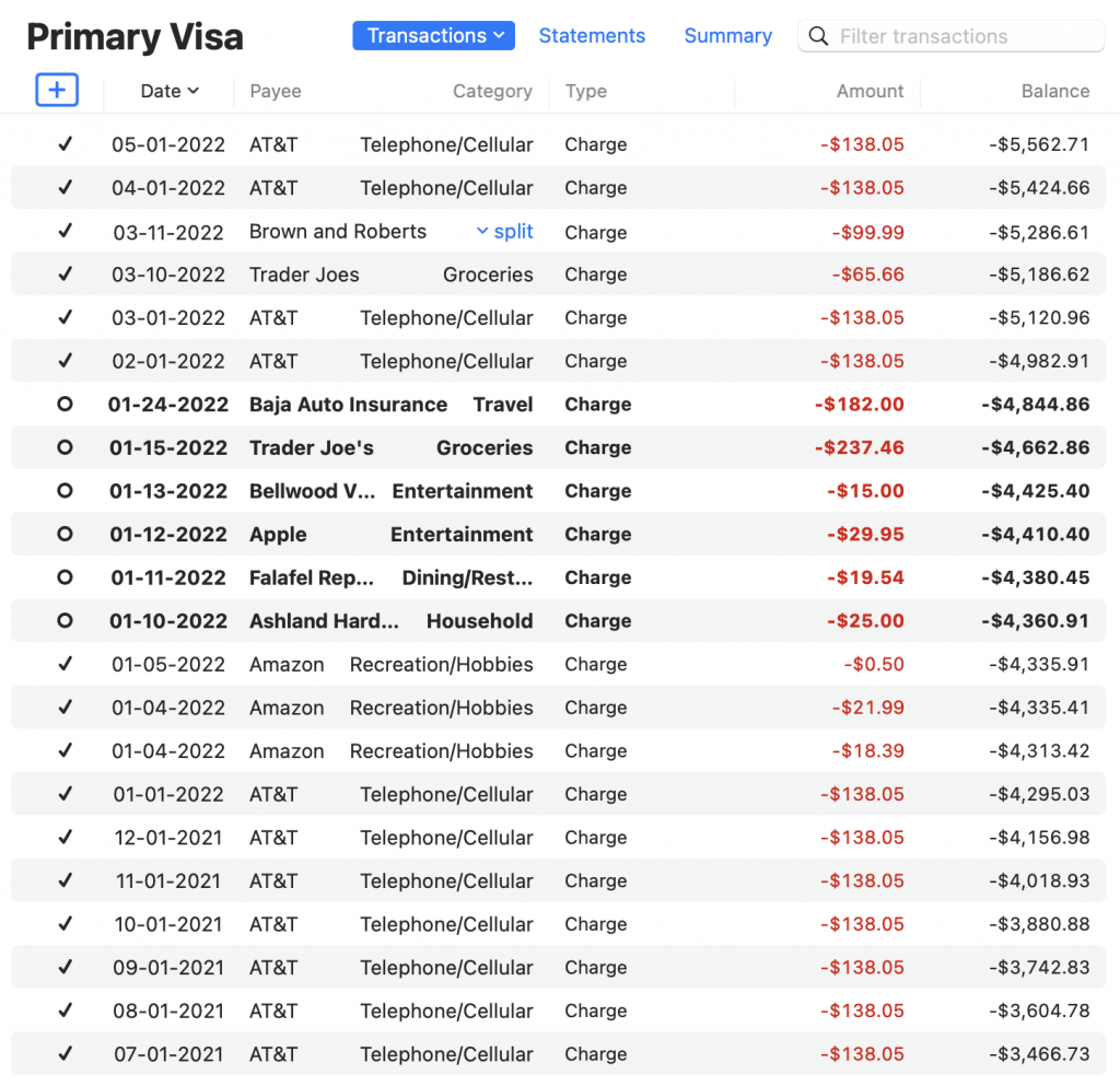
One of the challenging aspects of designing a single-line option is deciding which bits of the transaction info should appear. And I know some of you are probably thinking, well, why not allow the customer to show/hide what columns they want? This isn’t a bad idea, but it’s beyond the scope of the work we are doing right now. So we took a stab at it and include the 7 columns: cleared/reconcile, date, payee, category, type, amount, and running balance.
You’ll notice we don’t show notes, memo, or check number and we’ve collapsed the withdrawal/deposit into a single column.
This is a short blog post – it’s really just to show this new feature under development and get your feedback. Thanks for reading!
– Ian
- Building the Future of Banktivity: Organizer Progress Report - October 17, 2025
- Filed Away Forever: Why We Built The Organizer - April 25, 2025
- Banktivity 9.5 and Monthly Subscriptions - October 18, 2024
Looking good. Funny you anticipated about custom columns
About reports
I wish reports behave like custom playlist on iTunes or custom search on finder
And if can. Any plan add new providers like Belvo to DA2 ?
Tag is need
Definitely need tags visible
Without Tag, this is not useful.
We now append the tags to the payee name in single-line mode.
Is this an option (one-/two-line register)? Per account (perhaps in a later version)? I do like the compact format that fits more per screen. I do like to see the note field, but I wouldn’t sacrifice any of the fields you’ve included to make room for it.
Happy user for about 14 years.
I should specified. This is an application wide option, which you can turn on/off via a menu command (and hot key).
Thank goodness for that 👍
I’m glad to see the two line register will be available via toggle. I have over 50 accounts in two documents, with a need to see all the info on several transactions frequently. So, if it is not selectable like it is now, I’ll stick with the current BK version. The color coding will be great!
Hi, Ian! From your reply above, am I correct to understand that the single line register is an option that can be turned off in favour of the former register format with the additional details showing? I looked for a menu command pertaining to the register format and couldn’t find it. Can you point me in the right direction? It REALLY helps me to be able to see the MEMO details! Thanks in advance. -Sandra.
You’ll be able to do this in Banktivity 9, which we haven’t released yet.
Along with this option, I hope in v9 there’s more delineation of the details shown by using font weights and colors. In v8 using dark mode, the info is all the same weight and color with no hierarchy of importance for your eye to separate the entries.
I agree with Cooper! I have to turn off dark mode to use Banktivity at night.
For this single line display, I like how concise it is. These would be the columns most important to me, and I think consolidation of money in/out to a single coloured value is nice. Please make sure you give colour options to keep it accessible for those with colour blindness issues. Could you click on one line and expand it to reveal the other information that is hidden?
I am a fan of the current register but if this was a toggle option that would be the bomb. I can see myself staying in double lines BUT I do see a function for this view via a toggle. You will make me VERY happy if the numbers are in colour (been waiting since 2012) !!
As for your question, yes I do think that is the optimal column view for items, I see this as a register summary if you don’t want all the detail that double lines provide. I am going to program a PF key to toggle this mode, awesome idea.
I agree. The option to switch between single line and double line would be good:
– Transactions (Single Line)
– Transactions (Double Line)
– Statements
– Summary
The thing I like the most is the in/out being in the same column with their colour being the differentiator (red/black). So much easier to scan transaction values.
Tags could be included but I think the way to do that would be to perhaps allow people to add colour to a tag. then you could simply show that colour tag in a column without taking up much screen real estate. Hovering over it could reveal a ‘tool tip’ with the tag’s name.
If you could include an account summary at the top half, with transactions below, on the Mac version (like you can see on the iPad) that would be the icing the cake.
Looking forward to the update!
Thanks for sharing. I would trade the Type for Tag and/or Notes, or at least have an option (hover, tooltip, expand on click, …) to see tag and notes info for a given transaction.
I agree Antoine. If the debits are red (as an option) and the credits are green, this could help delineate visually instead of wasting a column on ‘charge’, for example. Tags should replace ‘Type’ because they offer a level of hierarchy in reporting. For those of with many accounts to track, the tags feature is critical.
Thanks for the feedback. One thing to keep in mind is the Type column does become significantly more important with investment accounts (e.g. Buy, Sell, Dividend, Split and so on).
Will the column widths be resizable like in the Finder?
Can’t get excited about a 1-line register …
I’ve been using iBank/Banktivity since the beginning (v1). I liked iBank 2, where when a transaction (1 line) was selected, a whole area would open at the bottom of the register with all the fields expended.
The Type is irrelevant
Note is very important
Thanks for sharing your ongoing work — keeps bringing me back to Banktivity in anticipation of v9. I much prefer a single-line register and think you’ve made good choices. But (you knew that was coming, right?), for me at least, one of them is going to be a chronic hassle: not having notes. We have a ton of transactions with Amazon and big box stores and use notes to document our purchases. I’d probably use the one-line register as my primary choice, but I can almost guarantee that I’ll get annoyed by needing to flip back and forth. I’d give up “Type” in a heartbeat to make room.
Yes, ‘Type’ seems redundant if the ledger clearly shows whether it’s a deposit/withdrawal with colour.
Whether the withdrawal is a ‘transfer’ or a ‘purchase’ doesn’t really matter as the ‘Category’ makes this obvious. They ‘Type’ column is also quite wide, yet the Payee column is truncated.
If we don’t get to pick our own columns (which would be very helpful), I would recommend replacing “Type” with “Memo”, which is much more useful. Thank you.
Ian, the single line register option is a great choice and the color coding by transaction type is another winner. Shaun’s comment about accessibility will be very important for some Banktivity subscribers.
One addition I would like to see for either the single or double line is a “fly-out” or another option to expand the selected line to make all fields visible. This is very helpful when you have similar items and you are looking for a specific entry.
Thanks for sharing a part of the development roadmap.
Best suggestions I’ve seen.
Ian, the single line register option is a great choice and the color coding by transaction type is another winner. Shaun’s comment about accessibility will be very important for some Banktivity subscribers.
One addition I would like to see for either the single or double line is a “fly-out” or another option to expand the selected line to make all fields visible. This is very helpful when you have similar items and you are looking for a specific entry.
Thanks for sharing a part of the development roadmap. I’m looking forward to all the new capabilities in V9
I would add the Tags column instead of the Type column too, because as others said already, it would be redundant with the Amount text color.
I assume you want to maximize the amount of information that can be displayed. So it’s best to include fields that vary a lot (high entropy). I think “Type” is less likely to vary, so perhaps Memo or Tag could be included instead. You may also want to consider using icons for Type, and perhaps Tag?
I noticed that the Category column is right-aligned. This makes it hard to do a quick vertical scan, and to search for subcategories.
Why do we need columns to indicate if the transaction has cleared, and also for the type of transaction? I only download transacstions from the server, so if it has downloaded into Banktivity, then obviously the transaction has cleared. Charges are shown in the screenshot in a red font, so I assume deposits would be shown as green? If so, we really don’t need a separate column showing us the type. Besides, I’ve noticed these are never consistent anyway. They can come across as POS or Withdrawl, both as regualar purchases where I had my debit card to a merchant.
Some Credit Cards download pending transactions first. E.g. Restaurant charges sometimes come in with the food amount from the original check and later come in with the total amount including tip. Cleared is different than downloaded in this case. (and in the case I list below)
** I like this one/two line option; especially the ability to change it with a hot key!
– I agree that Type can be handled by Amount and is a lower priority than Note/Memo or Tags. It seems some of us use notes more and some use tags more… I use Tags to group things and Note/Memo for detail info. I would prioritize Note/Memo over Tag here.
– Single column for Amount is great – color / (###,#.00) format helps
– My biggest wish for the register would be to have the ability to have downloaded transactions flagged as Pending first, then Cleared in the Register manually. As a User, I need a way to flag downloaded transactions that match my receipts and to see which downloaded transactions I do NOT have a receipt for. Having one downloaded & Cleared flag makes that very difficult.
– I really wish we could go back to Transaction color by Category — that was SO useful to me as I scan a register! I can’t understand why it was taken out – low use?
– And, as always I sure wish we could delete transactions without having to Confirm deleting the splits – THAT is redundant for double-entry… This should be an Application-level option.
Thanks!
Thanks for all the comments/suggestions! To see your pending (not cleared) transactions altogether, regardless of whether they are badged “NEW”, click the down arrow in the Transactions button and choose “Group New and Uncleared Transactions”
Yes, this ‘Group New & Pending Transactions’ is very, very useful. It’s so good it should be on by default for all accounts on first creation.
I’ve started using ‘Statements’ now too and I’m finding it to be very useful. It would be nice if it could visually show any ‘gaps’ in the statements, but otherwise it’s excellent.
…by ‘gaps’, I mean ‘temporal gaps’. For example if you have many statements it’s hard to know if every date has been covered. If there was a time period that is not covered by a statement it would be nice to see it reflected in the list as a ‘gap’ or ‘divider’ of some sort.
I agree with all those who say a single-line register sounds like a great option, so long as you can toggle back and forth. Also agree that transaction type is dispensable on the single line. Cleared status is, too. It would be good if you could show notes and/or tags, but I suppose I could just open an item (or toggle) if I want to see those. I do like having separate columns for charges and payments but could live with a single column for them. As is, most of my transactions have nothing on the second line except cleared status and transaction type, so single-line transactions make a lot of sense.
Hi Ian–I’ve been using Banktivity since version 4 (I think that was the earliest one I used) after years of Quicken and years on Wall Street working with financial planning software creation and use. I like detail so I prefer the multi line option of the present version (I’m still in Version 7 but now being forced to Version 8). Options are great, so for those who wish “more simple” it’s nice to have a single line option but please don’t take out the option for more detail for those of us who prefer that.
Don’t worry, the existing 2-line register is not going away.
Why not narrowing the category-column by only using the sub-category (i.e. “Cellular” instead of “Telephone/Cellular”) ?
I am looking forward to Banktivity 9 and the single line display. I very much need the Cleared status as I drop scheduled transactions into the register months, and sometimes years, into the future as a way of forecasting and budgeting. Is there any plan to add the feature found on the iPhone version that allows one to limit the view into the future to a month or a range of months? I know there is a way to do this in Transactions for past transactions, but no way to limit a forward range. Can you share a screenshot of how the Dark mode would look in single line mode, and include deposits as well as withdrawals? I know we are all curious how you intend to differentiate the two visually. Can you share an estimate when this new release will arrive? Thank you!
Looks nice. I agree with others. The Type column seems unnecessary. Seeing Note/Memo and Tags in this view would be much more helpful.
I think the Type column should be replaced with icons. There’s no need to see the word “Charge” or “Payment” repeated 50 times. A simply little icon would serve the purpose well and free up a lot of screen real estate. I would also move the (icon) Type column to the left next to the Cleared column.
Awesome upcoming change to offer single line. I would second my vote to replace type with memo. Typically transactions are imported without anything in the memo field, which means going through and adding that.
Without the memo field displaying, it would be necessary to click on each transaction to see if there was a memo already added. Could be a real waste of computer time opening transactions that didn’t need to be opened.
Excellent software!
To add to my previous comment, it might be a simple programming trick to use red (expense) or green (deposit) to show type instead of a field for that purpose.
I like the singe line. A great idea. More entries will be viewable on the screen
I am a bit old school like to see debits and credits in a separate column as per my banking and accounting background. You can see at a glance the credits. It looks too simple for me. I would like an option to keep two line entry. I think we need software with lots of user options too. One size doesn’t fit all user needs. Also to me the note column is important. I hope this is being continued.
I think the point is that this view is *optional* and you can toggle between it and the standard view. It’s an additional option, not a removal of an option.
Looking forward to V9 along with the upcoming changes. Did I miss on the blog the tentative release date?
How is document spin off going, all of this UI stuff is great but when it takes you 1min to post an entry and view your account because your document size is big is a bigger issue. Let’s make the product useable first then we can glitzy it up.
You must have some other issue because my Banktivity file is enormous, with data going back 25 years. It only takes a second for posting transactions & loading accounts.
Still waiting for Banktivity to implement automated categorization of investment transactions – I’ve been asking for years. Any progress?
For me the check number is important. We have a psychology practice and patients pay for each session. Many pay later by bank. I register such sessions as a check on an asset like a pseudo ‘accounts receivable’. When payment comes in, I book that as a transfer from the asset account to the company bank account, filling in the check number of the original booking. That way I can easily track what patiens to send a reminder.
We now show the check number 👍
If I create an entry with a split transaction, the amount left to be reconciled appears at the bottom of the transactions highlighted with a blue dot.
If I save the entry then re-open it to add further transactions, the entry highlighted with the blue dot is the first transaction. Why? If I don’t remember to go down and highlight the unreconciled amount with the blue dot, any amount I enter for a new transaction in the split at the bottom of the current list, changes the first transaction amount and eliminates the unreconciled amount.
How does this make any sense? Why does adding a new transaction have to do with the first amount changing to adjust the un-reconciled amount? If I re-open the split transaction the highlight should be down at the un-reconciled amount, not the first transaction. This has screwed me up numerous times when the first transaction gets changed.
Thia would be really nice to have this fixed in any update!
Thank you for the clear explanation. We should be able to get this addressed.
Tag over type.
If you let the User color-code tags, you could use just a few pixels for each tag in the defined color, with full name on hover.
We append tags to the payee now and we show a check number (when type is Check)
Is there a release date in mind for V9?
No specific date, but we have started a private beta. Next will be public beta.
Expected: Spring 2023.
Thank god!
The double-line register is what put me off iBank/Banktivity in the late-2000s
Have revisited your software having gone round the houses and I see it offers a great service otherwise so am very please you are introducing the single/double-lined toggle.
When’s the release of 9??
We are doing a private beta now and will release a public beta this spring.
I like the single line register, however, I the reconciled column would be more useful if it were between the Amount and Balance columns thereby greatly reducing eye and mouse movement when manual reconciliation needs to be made. This would increase accuracy and speed of data entry when manual reconciliation needs tome done.
I like the single line look, which could be useful for bank accounts. But some of the comments about not displaying Type would be really bad for my investment accounts. I depend upon seeing Type (Income, Dividend, Cap Gains Long & Short, Buy, Sell) and visually comparing it with Category to make sure I have categorized the transaction properly.
Yeah, this is exactly why we’ve decided to keep Type. It is just so important for investment accounts.
It’s been quite a while since an update… 😉
Yes, love the one-line option. I do hope this allows us to change the width of individual columns. If that were the case, we could have Type AND Notes.. When is v.9 coming?
We are getting close to wrapping up our private beta now. I hope to do a public beta in April.
Agree. An update on where this is at and an expected timeline would be much appreciated. It’s been 5 months since a blog update on status.
We are wrapping up the private beta now and then we will release a beta to the public this spring.
Ian – what are the odds that the envelope fill screen can be sorted and/or retained from the prior fill of envelopes? That enhancement alone would add huge value because I create envelopes with a number in front so sorting would make life so much easier. At a minimum just retain envelope orders from the prior fill.
Will look into this!
I hope that I will be able to switch the date display to ISO formatted dates within Banktivity independent of my Mac system preferences: e.g. 2023-04-18
Just to set expectations for this one: we haven’t done this.
Is there a way to make the columns adjustable in the single line register? I’d like to be able to expand the type to regain full word.
Not currently possible.