We’ve had an iBank version for the iPhone — iBank Mobile — since Apple released its first SDK about five years ago. Since then, the app has received numerous updates but nothing that expanded its primary use case — entering transactions quickly while on the go. However, times change and customers’ needs change. iPhones are extremely fast now, have more memory than ever, and people expect to be able to do more with their phones. So today I’m going to show you what we’ve been working hard on for the last several months: the next release of iBank for iPhone.
Before I show screenshots, I want to talk about some of the features it will have. First, one of its primary features will still be fast transaction entry. We don’t have plans to overhaul the transaction entry flow, we’ll just refresh the UI screens. Second, it will now have budgets! Yay, finally, you will be able to sync over your budgets from the Mac. Third, you will be able to see your investment account’s market value and it will download current stock quotes. Fourth, well, I don’t want to give away all of the upcoming features just yet. Seriously, we do have a few more things planned, but I’m not going to discuss them in this post.
I will state my usual disclaimer: the app is currently a work in progress. Many of the screens are showing live data, but have not received final UI polish, so please keep in mind the final shipping version will likely look a bit different.
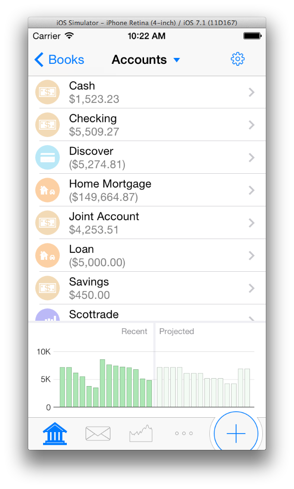 This is the Accounts Screen. Not surprisingly, it shows all of your accounts. Currently this is just a flat list, but I hope for a future build it will group them by account type like iBank for iPad does. From this screen you can drill down into an account to see its transactions. Below the list of accounts are two bars, one showing your recent net worth and one showing your projected net worth. You’ll also notice along the bottom are four different buttons that act like tabs to switch between showing Accounts, Budget, Investments and “More.” The + button is used to enter a transaction.
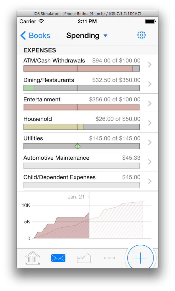 As on the iPad, you can see your budget on the iPhone. At the top of this screen is your budget by category, with visual indicators for bills (the little diamonds) and progress bars for gradual spending, like groceries. Along the bottom is a current snapshot of how well you are sticking to your budget. iBank for Mac and iBank for iPad users will find this type of budget graph familiar as it already exists in the shipping version for those devices.
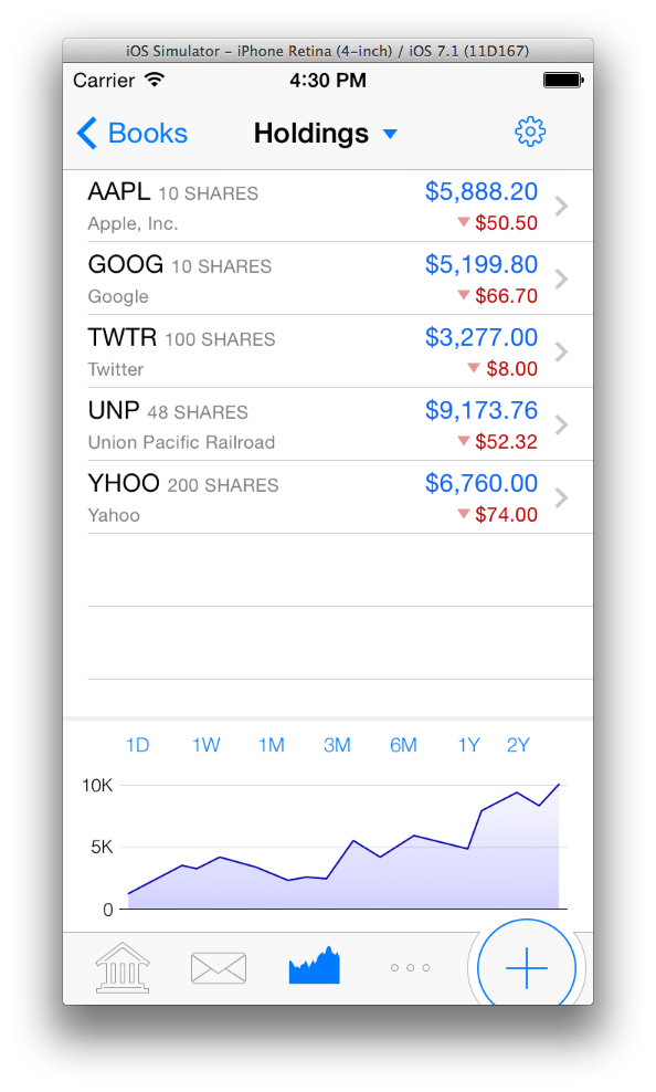
The last screenshot I want to talk about is the Holdings Screen. This is a view that pulls all of your investment data, across all accounts, and displays it summarized by security. This new way of displaying securities is something that users have wanted for a while and it’s making its debut in iBank for iPhone. You can toggle between what information is displayed by tapping the amounts column. This will switch between showing the security’s price and daily change, or value and daily gain/loss.
This version of iBank will also use our new sync engine, which we announced late last year. As we’ve mentioned before, this sync engine no longer requires a Mac to be the hub. At some point in the not-too-distant future, we will dedicate an entire post to our new sync solution. As excited as I am about sync, I won’t go into it any more here, except to say this new version of iBank for iPhone will only use this new sync solution.
I’m sure many are wondering about a the timing of a release. As is customary for this type of project, we don’t have a firm date yet. The app is still too young to be promising a release date. Just let it be known that it is currently being developed and moving along at a respectable pace. Since much of the code is shared with its iPad sibling, the development process is a bit faster than normal.
I can’t wait to get this app out there!
-Ian
- Building the Future of Banktivity: Organizer Progress Report - October 17, 2025
- Filed Away Forever: Why We Built The Organizer - April 25, 2025
- Banktivity 9.5 and Monthly Subscriptions - October 18, 2024
Looks great, Ian. But please make sure that it handles UK stock prices correctly – not multiply them by a factor of 100 as iBank Investor does.
This appears to be very close to what I requested a few months ago – an app that had the same functionality as the iPad app, and supported investment accounts. The interface is nice and clean and should lend itself well to the rumored larger screen size of the iPhone. Thanks very much for listening!
Can you let us know if this app will support all accounts that are setup in an iBank “Book”, and specifically, accounts for which the value is relatively static, e.g., real estate and other fixed assets that don’t need to be updated from market quotes.
Looks great , I use the app all the time and I find it indispensable. I am assuming that you will need to be at Ibank 5 level to synch to this new iPhone version ? I have not made the move yet though I have licensed it but I think the switch will become inevitable if you want to want the new features. A new synch engine is so necessary !!
Will you be able to only sync certain accounts? This was a huge performance problem for me in the old version as I have about 25 accounts, not all of which I care to sync to my iPhone…
Jay
I’ve looked at your screen shots a few times since posting my original comment. A couple of really “nice to haves” that I hope you’ll consider, and which would make using iBank mobile a greatly improved experience:
1. User customization – please allow users to turn on/off bold fonts, change font size and type, and provide some options for enhanced use of colors in ledgers and reports. This is something Quicken has and is very helpful on a small screen.
2. Single line ledger – instead of the fixed, two-line ledger in iBank for Mac, a single-line ledger option similar to what Quicken offers would be a big improvement and again, makes better use of small screen real estate.
3. Enhance the overall robustness of the product so that it can operate independently of desktop iBank.
4. Better report customization, especially investment reporting.
5. Add bank reconciliation functionality
6. Include a tax estimator, similar to what Quicken for Windows includes, that allows one to perform “what-if” estimates by inputting salary and investment income, deductions, etc.
7. Support attachments, such as bank statements, invoices, etc.
8. As much as possible, make the iPhone version compatible with the iPad version.
Please, no more massive fancy graphics eating up screen space, irritates me on the iPad and looks like it might be going the same way here.
When I go into an account I just want to see a list of transactions and a clean interface to add or amend.
The iPad transaction form is messy and made up of a mixture of different elements, something you got rid of on iBank for Mac years ago.
Looking forward to the new sync solution, sounds like a winner.
The design looks good. Some comments on features:
Please allow the user to group accounts into user-defined folders, rather than forcing a grouping by type. Better yet, allow a sync of these folders to the Mac and iPad. Grouping by type could still be a default option.
Second, please provide the option to show investment holdings by account, rather than forcing all holdings into a single list. Holdings by account would be much more useful. For example, it would avoid mixing IRA and non-IRA holdings.
Third, the “Budget” icon looks more like an icon for email. Perhaps a pie chart or other graphic actually used with the budgets would better tell the user “budget”.
Still it’s overall a great design and I’m looking forward to it.
Question about the new sync engine: Since I am currently using CloudSafe for sync and the new iBank Mobile 2 will use the new engine, how will al my devices (Mac, iPad, iPhone) stay in sync?
I must agree with the other Paul , please leave the accoutn lists and transaction lists free of graphs and graphoics if you can, they do have their place and are very valuable, but not at the expense of seeing key information all in one place.
I also agree with possibly the same or maybe another Paul, the refresh of the sync function could be good, as currently I don’t use my ipad for ibank as I can’t guarantee i can use my macbook as the hub between iphone and ipad changes, but I’m hoping the whole suite of apps are updated at the same time!
I note that your “designing this for iOS 7”. Will you actually ship it before iOS 8 is released?
Hi!
Please let us clear transaction as well.
Jon – this looks very exciting, I’m also looking forward to it.
One feature that would be great, if not already included, is selected which budget to show on the phone. I have 3 ongoing budgets – one is very aggregated – in Vs out at the highest category levels – another is only credit card spending (which is effectively all discretionary, and the one I’d like to track on my phone) and other other is complete, showing benefits, taxes etc, most of which I can’t control but I like to watch for any variations if they happen.
The budgets are very powerful in iBank, so it’d be great to choose exactly what gets tracked on the phone.
Thanks again for supporting Mac and iOS.
I use iBank for Mac, have iBank for ipad (but don’t really use) and iBank Mobile for my iPhone. I feel each have their place and for me iBank Mobile is a portable register system for my accounts. For me, I don’t know if I would use any of the features listed as upgrades in 2.0, but there is one feature that I have been wanting very much since the start that Bernie touched upon in his post.
I would love to be able to take a picture of a receipt and attach it to the transaction that I am working on. This would then be able to sync up with my other iBank devices and I can view them in any other device.
Thank you,
Mike
I want the colored icons for accounts back. Going to monochrome was a bad idea. I don’t care what Apple is doing, the colored icons give us a quick reference to the type of account.
Taking the color away was a dumb idea.
Dr. Rick Livingood
Something I use all the time in iBank mobile 1.0 is the “group as primary account” option.
I include my mortgage as one of my accounts, and when it is visible the scale of the graph makes it completely useless. My everyday accounts aren’t even a blip on the graph by comparison.
I find the graph useful with just my everyday accounts. Please tell me this option will exist in 2.0 🙂
When is the update going out? No updates for ibank mac and ibank mobile in a long while.