This post is going to be pretty simple: I want to focus entirely on iBank for iPad. We released iBank for iPad almost two years ago. Since then it’s received major updates and got a complete UI overhaul for iOS 7. iBank for iPad is the most robust and full-featured financial app for iPad and we are continuing to invest heavy resources into it. Today, I’m pleased to announce that iBank for iPad 2.1 will be released this spring. I’ve outlined the biggest new features in this post.
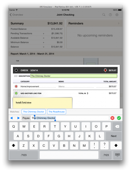
Autofill. One of the main features that has been conspicuously absent from iBank for iPad is type-ahead/autofill. For 2.1 we’ve implemented this in a way that allows the speed of autofill, while maintaining the easy, tap-to-select options we’ve had since version 1.0. As you begin typing in a payee, we autocomplete the appropriate values and we maintain a list of matching payees that you can tap if you want. I’ve been using this feature for a while and its really, really convenient. In the screenshot below you can see I typed in “Th” and it shows me the list of matches and autofills other fields, like amount and category.
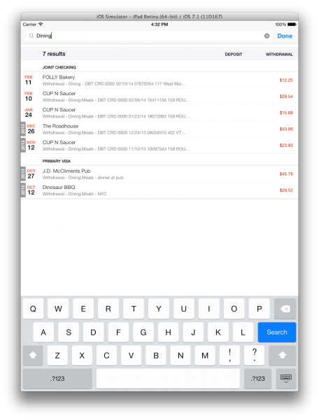
Search. Another feature that has been requested for a long time is search. We’ve added a new search toolbar button that is accessible from any screen. If you search from the overview screen, you’ll get results for all appropriate transactions separated by account. If you search while you are on an account’s page, you’ll just get transactions that are found in that account. Searching begins as soon as you stop or pause typing and results are presented as they are found. Once you find the transactions you are looking for you can double-tap to edit, delete or categorize.
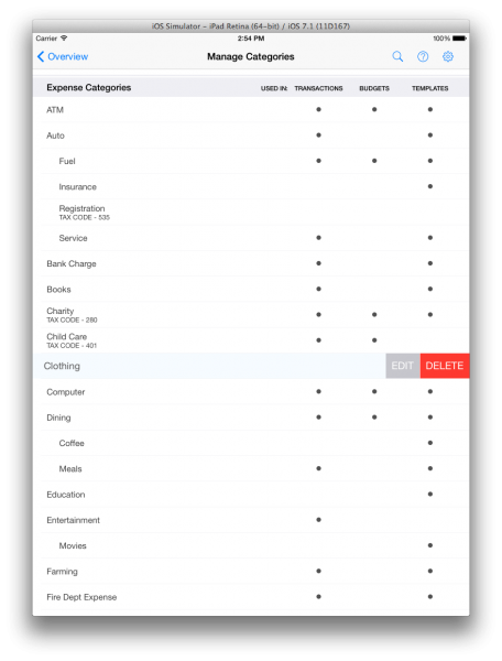
Manage. We also added a sections for managing Categories, Securities and Templates (aka Payees). You can now easily add, edit and delete categories in a single streamlined interface. The same goes for templates and securities. The screenshot below shows the Manage Categories screen. Just double-tap any row to edit or delete.
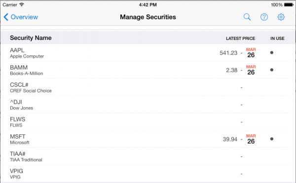
For managing securities you can also see if a security is “in use” — iBank displays its price as of the date of the last stock quote. Once again, double-tap a row to edit or delete.
I’ve been using iBank for iPad 2.1 for some time now and I’m really pleased with it. The addition of autofill is a huge time saver! I can’t wait to get it out to all of our existing (and new) customers in the coming weeks.
Thanks for reading.
-Ian
- A Little Help? - April 13, 2026
- Building the Future of Banktivity: Organizer Progress Report - October 17, 2025
- Filed Away Forever: Why We Built The Organizer - April 25, 2025
Finally! I’m very happy to be able to get rid of useless categories that have been filling up my screen. Auto-complete is a nice touch. Any hints on timing beyond “this spring?”
This is great news! I finally left QMac 2007 when I got iBank for iPad 2. These new features are very much needed and I am looking forward to the new release. When will 2.1 be available?
What about import and exporting data? Is that on your list of to-do’s. Your iphone app even has that option of at least exporting.
PS – it would be nice to complete the iOS 7 visual overhaul and get rid of the remaining skeuomorphic elements, specifically:
The account editing interface. — There’s still an on-screen paperclip(!), holding a note with useless/pretend information, where all that is really needed is a checkbox to hide or unhide the account. The “Note” section also still looks like an actual sticky note.
Though lacking the paperclip, the transaction editing interface also has the skeuomorphic sticky note.
I’d love to see the next version update these interfaces to be consistent with the rest of the clean flat design.
Sounds good for iPad users. Still waiting for an update for the iPhone with investment syncing.
I agree with your statement that iBank for iPad is the most comprehensive personal financial app available. That said, it could be better, primarily, by emulating the desktop version of iBank. In effect, it would be terrific news to the many iPad owners who view that platform as their primary, or only, computing device. My suggestions for iBank for iPad improvements include:
1. Enhance the overall robustness of the product so that it can operate independently of desktop iBank.
2. Make the look and feel as close as possible to desktop iBank.
3. Increase the use of color, or allow for preferences to be set to increase their use. For instance, different colors for different accounts, or ledgers, in effect, what Mint and Personal Capital have done.
4. Better report customization, especially investment reporting.
5. Improve the bank reconciliation process.
6. Include a tax estimator, similar to what Quicken for Windows includes, that allows one to perform “what-if” estimates by inputting salary and investment income, deductions, etc.
7. Support attachments, such as bank statements, invoices, etc.
8. Make the iPad version compatible with iPhone. The current iPhone app is as useless Quicken’s mobile app.
There are other improvements I would like to see, most of them minor. The foregoing may appear to be a list of complaints, but they’re not. It is a pleasure to be able to take my iPad with me, knowing that I can track my investments and other accounts as easily as if I were using iBank’s desktop version. I hope some of the above will be included to make an already outstanding product even better.
In an earlier response to this blog post, I suggested expanding the use of color and other visual enhancements. One of the more attractive features of iBank for iPad is its clean, streamlined dashboard. This really helps, and I wish iBank for Mac incorporated it, too.
The example I would suggest for purposes of color, graphics, etc. is Personal Capital’s iPad client. It is far more advanced than Mint in terms of investments. I hope this helps.
I’d like to acquire the iPad version, but, other than being extremely expensive, there are so many negative user comments. When will all the negative aspects be made positive/resolved?
@Larry we are always trying hard to make the our apps the best they can be. We think it is a great app and it’s important to remember that most online reviews are from disgruntled customers, those that like our apps and think they are great, don’t review as frequently.
How do I edit the autofill categories? My autofill is littered with partially capitalized categories, as when I enter “Ama” for “Amazon”, autofill recognizes it and uses the rest of the line but doesn’t change what I’ve already entered, so I now get: AmaZON (since AMAZON) was originally autofilled in all caps. How do I delete these transmogrifications in favor of the neater, properly capitalized (either ALL or First Letter, but not RanDOM) autofills?
@Rex Go to View > Show Transaction Templates and then you can add/edit/delete them
So what’s the status of support for envelope budgeting for the iPad and iPhone?
This is a feature that makes sense, but we don’t have it a timeline to announce for it.
How do I recoiled my accounts on iPad.