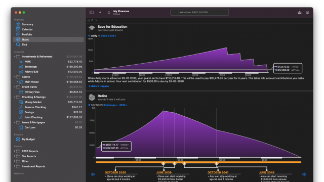
IGG Developers' Blog

Archive for the ‘iPad’ Category

iBank Access

Wednesday, February 8th, 2012

In one of the earliest blog posts about our forthcoming iBank for iPad app, I talked about how ease of use was a driving force in its design. In this post, I want to go into more detail about what we mean by that. Specifically, I will cover some ways you get your financial data into the app that don’t involve entering everything manually.

When you first set up a document you’ll be presented with a choice: do you want to sync with iBank for Mac or use the app standalone? If you choose to sync with iBank for Mac, your account data will be transferred over, including all security/investment transactions – unlike in iBank Mobile. You can then edit your transactions, add new transactions, add/edit/delete accounts, etc. There isn’t anything too new with this concept, yet there are some non-trivial improvements over iBank Mobile syncing.

The more interesting discussion occurs when we talk about choosing to use the app “standalone.” We knew from Day 1 that if we developed iBank for iPad we needed to have a really good solution to aggregating your financial data. Manually entering transactions is so 1990s. The current OFX solution we have in iBank for Mac works great, if your bank supports it. The problem is, there are too many banks that don’t support it and likely never will. We also considered having users log in to their banks’ websites via Safari on the iPad, or having an embedded WebView (much like the built-in browser in iBank for Mac). But this solution is wrought with problems too – the biggest being it can get tedious fast if you have more than a couple of accounts.

I’m pleased to announce that we have a solution that allows our users to connect to thousands more financial institutions than what we currently support via OFX. While not every bank is supported, it’s easily a ten-fold increase over our existing supported financial institutions. Even the little credit union here in southern Vermont works. We’ve partnered with a company to assist us with this account aggregation and we are really excited about their services.

Having this ability to get data from so many banks, coupled with the any time, anywhere mobility of the iPad, pointed to a name for the app that seemed both obvious and inevitable. We call it iBank Access.

Here is how it works (and note that none of the screenshots here are final). The account set-up assistant gives you two choices when you create a new account. You can either set up a “manual account” for which no automatic downloading will take place, or choose to link the new account to a financial institution. If you choose the latter, you are asked to type in the name of the bank where the account is held. This is where our massive list of supported banks gets filtered as you type:


After you enter valid credentials to log in to the bank’s website, you are given a list of accounts that you have at that financial institution – with the option of choosing which accounts you actually want in iBank. For example, many folks might have a checking, savings and even credit card all at the same bank and in the last screen you would be given the option to choose which of these you might not want to import. Most users will link all of the accounts. When the accounts are created, iBank imports available historical transactions associated with each account and even does some automatic categorization. Here is where the beauty of our new aggregation system really begins to shine. Each time you launch the app, it goes out and fetches any new transactions. Unlike iBank for Mac, however, there is no separate window that appears where you have to manually verify which transactions to import. The new transactions just automatically appear conveniently marked:

Transactions that have been manually entered are matched based on date and amount, and their status is updated as appropriate.

As you can see, the process of updating accounts is really not much of a process at all. They just update. No more download or import button, no import window where you have to manually reconcile each transaction. It all just happens when a user opens their document. I’ve been using the app daily, and just having all of my personal accounts up to date, all the time, is pretty amazing.

To be transparent, there is a downside to this approach: it will cost money. Again, current users of iBank who are satisfied with the state of their accounts will simply be able to sync their desktop data to iBank Access. We know many of our current iBank users already have iPads, and while we haven’t settled on a final price for the app, the goal here is to make it an inexpensive add-on.

But in keeping the app affordable, we didn’t want to take the approach some competitors do and sell your personal financial information (while marketing the service as “free”). I don’t want ads for credit card offers or loan refinancing, so our model is simple: if the user wants to take advantage of automatic account data aggregation, there’s a small monthly subscription fee. We don’t have an exact price point yet, but I anticipate something in the range of a fancy cup of coffee. Because there are significant, ongoing costs in partnering with a third-party aggregator of bank data, a pricing structure with an optional subscription seemed the best model for all users: no ads, a reasonable app price, a nominal cost for those who want data updates automated, but no extra fees for those who sync with iBank.

There’s still lots more to tell you about iBank Access. In future posts I hope to cover in detail some of the other features we are really excited about.

-Ian


No Name, But We Got Game

Saturday, January 7th, 2012

Even if we don’t yet have a name for it, development of iBank for iPad has been on going for over a year now. In an earlier post I talked about some of the design decisions and metaphors used for iBank for iPad. There is one in particular that is relevant to the short tour I’m about to give of iBank for iPad:

You can think of it as having your own personal financial report  on your iPad. If you sat down with a financial planner who asked a series of comprehensive questions to get a handle on your finances, what you would walk away with would be like our iPad app — your complete financial picture, always up-to-date.

The screenshots you are about to see are not polished and not final. Some still contain debugging code and some have pretty poor formatting, so please ignore this for now. For this post I want to offer of a broad overview; future posts will delve into specifics of its functionality.

So without further ado, here is one of the first screens you’ll see in iBank for iPad.


In this screen you can see we’ve embraced a “portfolio on a desk” metaphor. Each portfolio is an iBank document, and so yes: this app will support multiple documents (unlike iBank Mobile). A swipe gesture lets you browse the documents, the + button creates a new one, and the trash icon deletes the centered document. When you press the + button, you are taken to a modal “assistant” that walks you through document setup. Tapping one of the leather bound portfolios opens it to reveal the “document home screen”:


The Document Home Screen is the heads-up display (HUD) for your financial life. Everything you wanted to know is here. The idea is that you are looking at a financial report that is on “magical paper” — with binding on top (which conveniently acts as a toolbar). The paper can expand in size to accommodate users with lots of accounts and it responds to various touch gestures including dynamic interactions. At the top of the page you’ll notice there are two boxes: summary information for all classes of finances, and to the right of that, your upcoming bills and notifications. You’ll also see that all of your accounts are listed and grouped into general categories: “Bank Accounts,” “Investments,” “Mortgages and Loans,” etc.

Touching the various elements causes a new sheet of paper to slide in from the right. For example, if you tap “Credit Card” the new “sheet of paper” that slides in shows the details for that account:


Although it isn’t evident in this screenshot, the selection on the bar chart drives the transaction list below. So if you wanted to see transactions from September to November you would select that range in the chart. To edit a transaction, you simply tap it, and to get back to the Document Home View, you just swipe the page to the right to make it go away. (You can ignore the debugging info at the top of the page — as I said, these screens aren’t polished.)

From the Document Home Screen, if you select an investment account a new piece of paper slides in, but we customize what is displayed to emphasize the investments in the account.

Notice on this screen the Positions table (but ignore that temporary green color used in the bars). Here you have an overview of how each of your investments is doing. Tapping a position slides in a new sheet showing additional details of the specified security along with a list of all transactions associated with the security in the account.

So that is a brief overview of iBank for iPad. I haven’t shown all of the screens as I want to save some goodies for the next post. But this should give you a pretty good sense of how this app will work and how to navigate through it.

-Ian